 [/custom_frame_left]
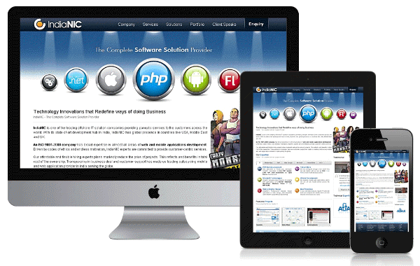
With the proliferation of mobiles and tablets more and more people now access the web using them, sometimes considering them to be their primary computing device. The world changed when the Iphone was launched it heralded a new direction where the humble mobile phone became a computing device. These days quite a number of people, including me, use their tablets as their primary computing and content consumption device, relegating the bulky laptops and desktops to specialised work. But for quite a long time websites were not optimised to take advantage of this new medium nor the touch interface. People developed drab looking mobile sites that sure did load faster but did not provide the true feel, branding and overall wow effect on looking at those sites through the traditional computing devices.
But a change is in the offing, with more and more developers understanding the shift in usage and the need to have a consistent look and feel, html 5 was envisioned with Responsive Web Designs (RWD) as one of its corner stone. Responsive Web Design is truly one of the key technologies for future web design and development, as the multitude of smart phones & tablets with each having its own screen size & pixels required to be catered to in a consistent fashion along with the traditional computing devices. In turn Companies also know that the changing pattern of usage show a huge shift into the new modes of computing devices and thus those who fail to adapt will surely perish.
Responsive Web design is not a single piece of technology, but rather, a set of techniques and ideas that form a whole. Responsive Web designs Works by dynamically resizing and rearranging the layout of a website depending on the device used to access the website. While this calls for more complicated coding, it helps by having a consistent look and feel across all content consumption devices. One of the key points that developers have to rethink about is to think in relative sizes and not in absolute sizes as the content has to resize itself according to display screen. So the usage of pixel as a unit is shunned and instead percentages are used. Responsive Web Design provides a dramatic change from the past where now the developer focuses on optimising the site for smaller screens and then works his way up to the larger ones, in essence catering to the medium from which most likely first views of a website are going to come from.
There are many disadvantages pointed out about RWD, Such as the slower processing speed of mobiles and the networks, but all of these disadvantages assumes that the technology driving these devices are going to remain static. For a long time they did, But now as these devices are proper computing machines which are progressing and becoming faster in pace with changes to the traditional modes of computing these disadvantages are no more relevant as the relentless march of technology bulldozes them out of the way. In Essence Responsive Web Designs is the future not because people are using tablets or mobiles to access the internet but because these devices are the next mainstream computing and content consumption devices usurping the traditional role played by the desktops and laptops for so long.
[divider_top]
 WebSolvant New Delhi Web Designers and Developers Company


